

Thank you for viewing this article and I hope you find my method for enlarging images in Power Apps useful. It is achieved using basic concepts in Power Apps without any code components.
Introduction
This article shows you how to enlarge images in Power Apps and control the zoom and position of the image. It gives users the ability to zoom into a particular part of an image if desired by opening an enlarged view.
Uploading images
The first step was to upload a set of images to the app onto a separate screen and rename them accordingly. The renamed images were used in a collection to load the gallery content.
The source data including the planet images used for this article was from solarsystem.nasa.gov.

The following code was used to collect the planet names and corresponding images into a collection called colMySpaceImages:
ClearCollect(
    colMySpaceImages,
    Table(
        {
            Title: "Mercury",
            SVG: img_Mercury.Image
        },
        {
            Title: "Venus",
            SVG: img_Venus.Image
        },
        {
            Title: "Earth",
            SVG:img_Earth.Image
        },
        {
            Title: "Mars",
            SVG: img_Mars.Image
        },
        {
            Title: "Jupiter",
            SVG: img_Jupiter.Image
        },
        {
            Title: "Saturn",
            SVG: img_Saturn.Image
        }
    )
)
Setting up the image viewer
I used two SVGs to create the background screen elements on a new screen. The dark background gradient SVG can be inserted into an image once downloaded.
The black rounded rectangle shapes with drop shadows can inserted into an image once downloaded.
The content of the .txt files can be pasted directly into images within Power Apps to display the SVGs.

Setting up the gallery
Next, I added a vertical gallery over the largest black shape. The gallery was customised and styled using the methods described in a related article called 'iOS gallery styling in Power Apps'. The article can be view here (opens in new tab):

This gallery was connected to a collection called colMySpaceGallery. The code I used for the collection can be downloaded here:
The OnSelect property of the gallery was changed to set a variable as follows:
Set(gloVarSelectedPlanet, ThisItem)
The Fill property of the button positioned on the top layer of the gallery was customised with a condition to only show when selected.
If(
    ThisItem.Item = gloVarSelectedPlanet.Item,
    RGBA(
        255,
        255,
        255,
        0.1
    ),
    Color.Transparent
)
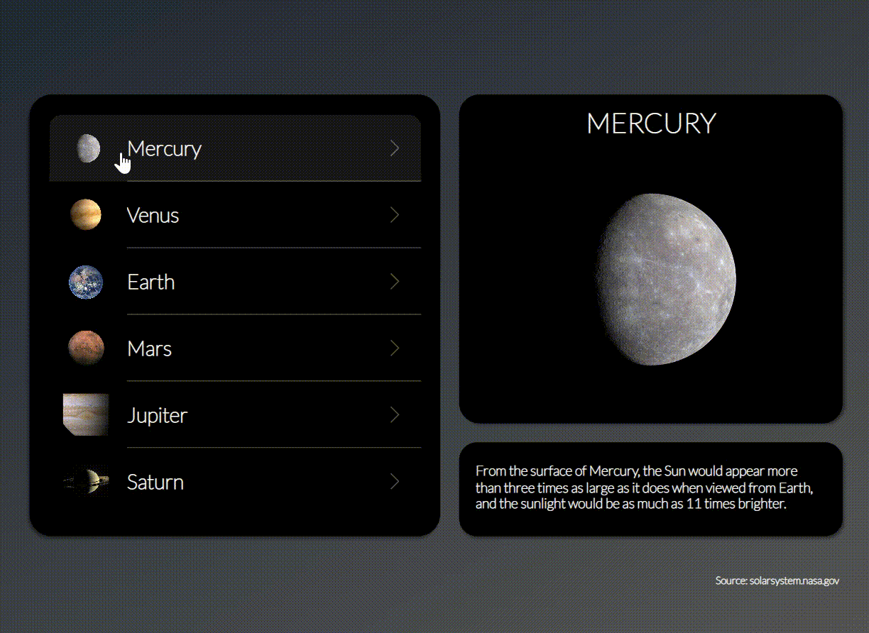
Displaying the selected planet
I then added two text labels and an image over the remaining background shapes. The top label displays the selected planet name, the image displays the selected planet image and the bottom label displays the selected planet description. These were linked to the variable I set previously.

Adding the hover icon
I wanted users to see a zoom icon when hovering over the planet image indicating that the image could be enlarged. This was achieved by overlaying the 'zoom in' icon over the image with the following properties:

The zoom in icon had a Boolean variable set to the OnSelect property which controlled the visibility of the expanded window.
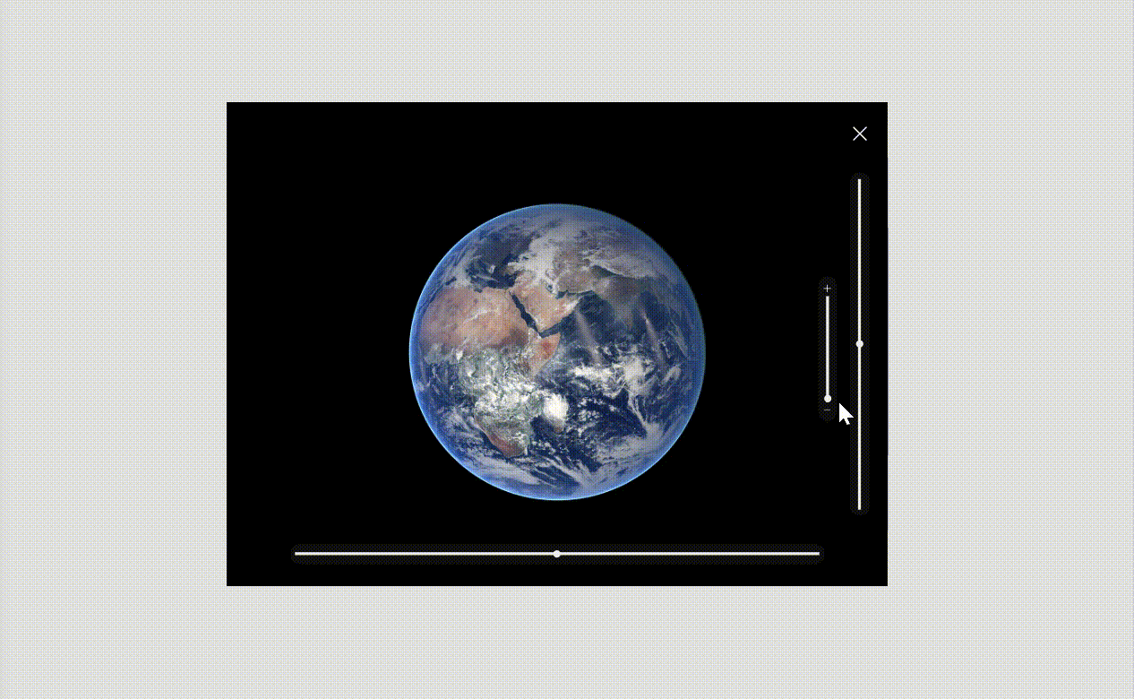
Creating the expanded image view
All elements in the expanded view window opened in front of the other elements and needed a visible property set to a Boolean variable called gloVarExpandedWindow. The image containing the expanded view was set to an Image Position of 'Fit'. A black rectangle was added to hide the other elements behind it.

I then added a 'Close' icon which reversed the expanded window visibility variable, hiding all elements in the expanded view.

Adding slider controls
Three slider controls were added and used to control the zoom and position of the expanded image. The parameters of the sliders are given in the image below. The visibility of the three sliders was also set to the gloVarExpandedWindow variable.

Optional additional styling - I added three rounded rectangular SVG shapes behind the slider bars to enhance visibility when appearing on lighter images. I also added plus and minus icons on the zoom slider to indicate the zoom direction.

Linking the image to the slider controls
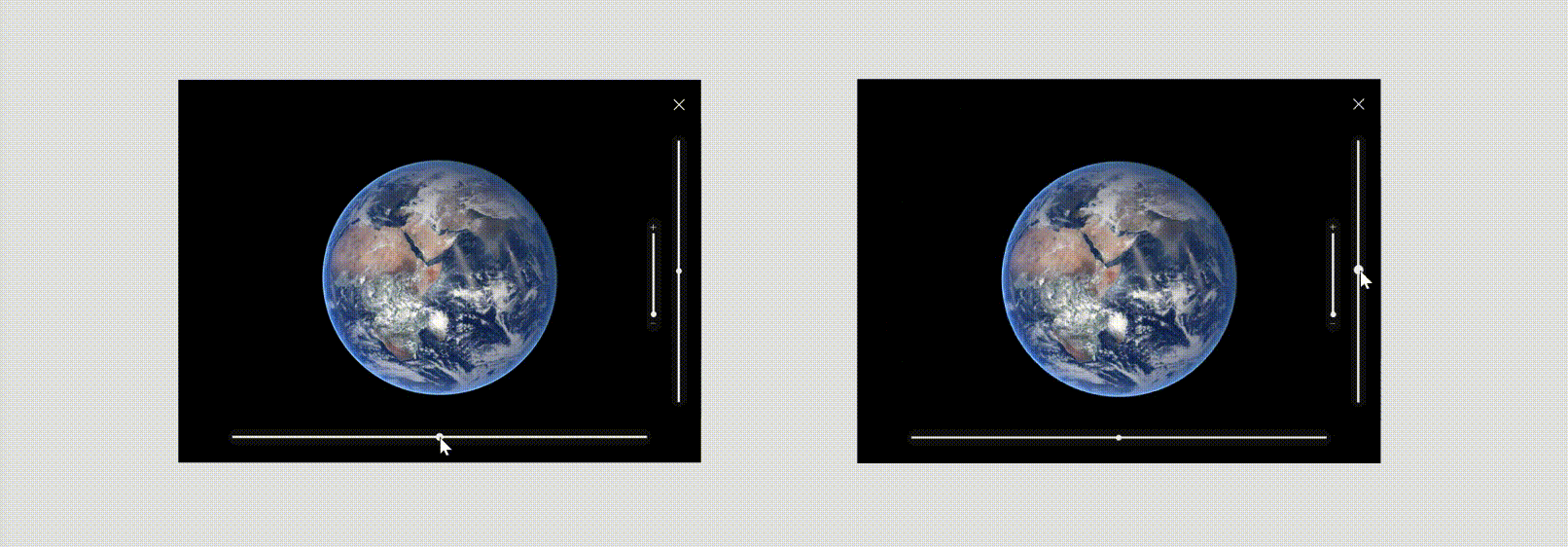
Here's the important bit. The height and width of the image needed to be linked to the zoom slider control in order to change the scale of the image. The number indicates the existing image height and width plus the value of the slider control.

The image scale increased depending on the value of the slider, however the image was anchored to the top left-hand corner rather than expanding and retaining a centred view. This was fixed in a later step by adjusting the x and y position of the image.
The position was then linked to the x and y sliders. Note that a container could not be used to group all the elements in the expanded view as the image was not able to move outside the confines of the screen. The animation below illustrates how the sliders controlled the position of the expanded image.
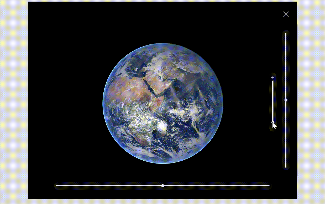
I used the code below to control the x and y values of the image. Half the zoom slider value was subtracted to keep the image centred.

Here is the result, with a zoom focussing into the centre of the expanded image.
I then added Reset functions to the 'Close' icon to revert the sliders back to their default values when the next image is opened.

Finally, I added a label to the expanded view displaying the planet name.

That's it!
I hope you found this a useful article that can be applied to many different scenarios without any code components. My method uses elements that are available 'out of the box' in canvas apps and I have tried to simplify it as much as possible.
Please get in touch if you have any questions or comments.